Join devRant
Do all the things like
++ or -- rants, post your own rants, comment on others' rants and build your customized dev avatar
Sign Up
Pipeless API

From the creators of devRant, Pipeless lets you power real-time personalized recommendations and activity feeds using a simple API
Learn More
Related Rants

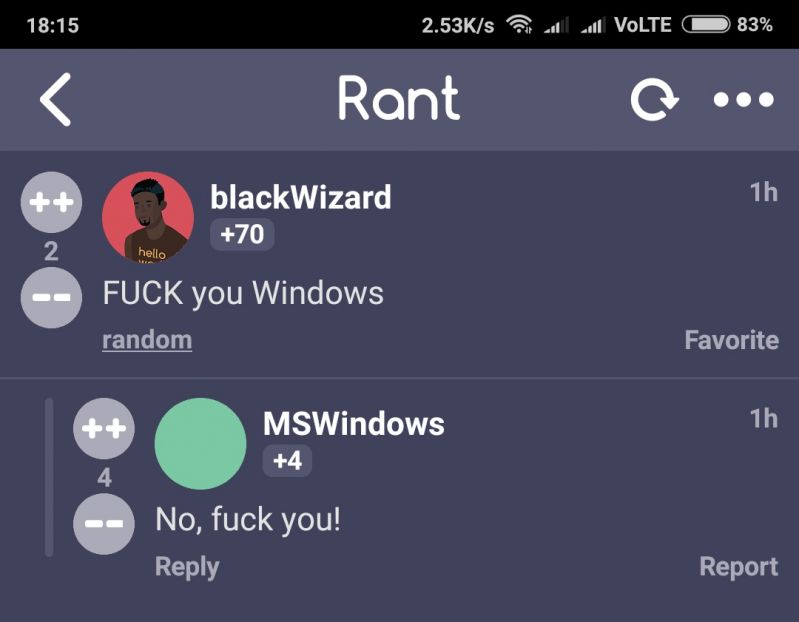
 Made my day 😂😂
 This made me laugh
I hate the new Teams. It's showing a distracting red icon in the activity bar when someone's sent a chat. Then, when clicking the chat icon in Teams you'd expect it to take me there so I could reset the chat and make it stop showing that irritating red notification in the activity bar. But NO, nothing happens when clicking the chat icon. Useless UX to say the least! This is one of the main reasons why I never use Teams for chatting, and I only open the application for meetings and then immediately shut it down. How come Microsoft, that's been around for so fucking long, still haven't learnt to design consistent, user-friendly and distraction-free applications? I think the answer is: They don't give a shit.
devrant
teams
microsoft