Ranter
Join devRant
Do all the things like
++ or -- rants, post your own rants, comment on others' rants and build your customized dev avatar
Sign Up
Pipeless API

From the creators of devRant, Pipeless lets you power real-time personalized recommendations and activity feeds using a simple API
Learn More
Comments
-
 drRoss48429y@g-m-f Yeah but you could just have an 'are you sure?' prompt on button press. It might even ask that already, but I don't want to risk it now. 😂
 -
@drRoss just loged out and loged in, that prompt you we're talking, it doesn't exist 😂
The button logs you out immediatly after you press it -
 drRoss48429y@TheInitializer @sylar182 Someone had to say it. But the reality is that I use Cyanogenmod LiveDisplay as well Twilight to tone down my screen.
 -
@g-m-f I would actually agree with you here. If you use dev options in android to see layout boundaries it looks like this... Which looks intentional cc @dfox

-
 dfox421449yIt's intentional. And for delete we have multiple confirmations but I can say with 100% certainty, as I've been told many times by users on devRant, that people click "yes" on confirmation dialogs even when they don't want to perform the action. This is why we can't have nice things lol.
 -
-
I like github's method where it forces you to type the repository name to delete it.
-
I just make them type DELETE in caps, where if they delete there account they can't come back at me and sat they didn't want to or if they do I can be a smartass
Related Rants

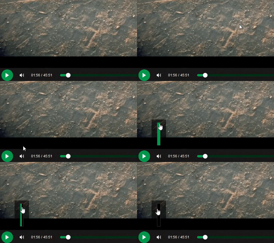
 My friend said an intern designed this UI for an internal site.
No. Just... no
 Product dev: We need a new volume slider for ou...
Dev: Say no more!
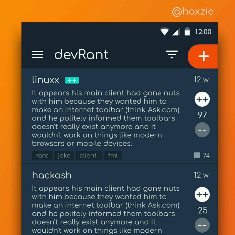
 Been looking around ways to improve devrant's user experience a little, Idk whether you guys like it or not.. ...
Does anyone else have a bigger than necessary gap in their log out button?
Just realised it's Christmas morning and I'm posting about a UI problem...
What is my life.
undefined
christmas
log out
ui