Ranter
Join devRant
Do all the things like
++ or -- rants, post your own rants, comment on others' rants and build your customized dev avatar
Sign Up
Pipeless API

From the creators of devRant, Pipeless lets you power real-time personalized recommendations and activity feeds using a simple API
Learn More
Comments
-
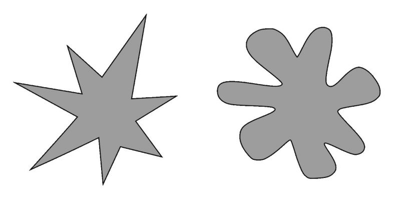
 kiki368555yPLEASE make the kiki shaped upvote and bouba shaped downvote IM BEGGING YOU. Please make this happen. At least make the switch in settings that does this PLEASE PLEASE PLEASE
 -
@frogstair I actually did notice that as well, will make them smaller (I also noticed that I forgot to add dividers, I think)
-
 kiki368555yAlso I’m the UX engineer. If you need help with design please don’t hesitate to dm me https://t.me/uyouthe
 -
@uyouthe YOOO I will make sure to do that, I will DEFINITELY do that.
Note: if you wanna try the layout for yourself, I have the source code on GitHub (wait a couple minutes before cloning, about to push something). If you have an iOS 14 device then you can build it yourself and try it out. Note: MANY things there are *kinda* placeholders, but the rant feed IS live.
Repo:
https://github.com/OmerFlame/... -
@AlgoRythm SF Symbols doesn’t have a system icon that has 2 pluses, so I had to roll with what I had.
-
@AlgoRythm It’s much harder and I wanted something which was easily accessible, and iOS is slowly shifting into SF Symbols so I wanna conform to that
-
 Root770735y• Why so blue? Why blue at all?
• Black theme is 👌🏻
• ++ and -- should be more noticeable. And unary increment/decrement operators, not just + and - we are devs, after all.
• Rants should have a nice visual cutoff. (Personally I’m a fan of boxdrawing)
• I would like to see the avvy and name of the poster, but it’s okay if this isn’t in; I also enjoy guessing.
• color-coded scores would be neat
• color-coded rant tags would be 👌🏻. Rant could be red, question cerulean, random random per letter, joke/meme brown because shitposting -
@uyouthe wouldn't it be useful to list more contact options than just telegram? I mean people who don't have telegram will probably be like 'okay nevermind' right now 😅
-
@Root thanks for the feedback! I will look into custom icons, but that is mostly cosmetic so I will finish mandatory features first and then move onto cosmetic.
Though I really did like the color-coded tags, these are good.
Related Rants
-
 Froot55Getting married tomorrow!!! Holy shit!! I'm kind of scared actually. But in a good way 😄 And here I am, i...
 -
 darthy43
 7 years of innovation and best design teams on the planet... can you tell the difference?
 -
 RiderExMachina22Oh my god... Storytime. A customer comes in with I assume is his father or grandfather. Customer: I need a c...


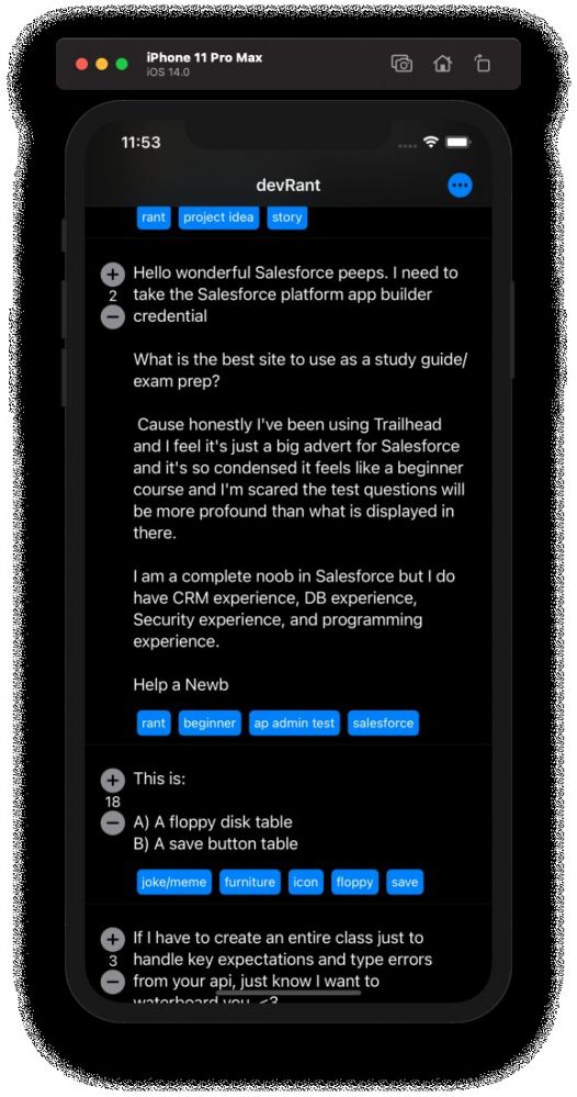
The final *design* of the main feed!
Note: this is a real fetch from the devRant APIs
rant
progress
holy shit
looks good!