

Join devRant
Do all the things like
++ or -- rants, post your own rants, comment on others' rants and build your customized dev avatar
Sign Up
Pipeless API
From the creators of devRant, Pipeless lets you power real-time personalized recommendations and activity feeds using a simple API
Learn More


Related Rants

 How to vertically center in css..
 Yeah no
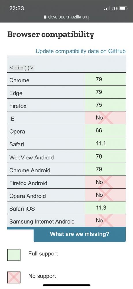
CSS quick maffs:
Using viewport units to define font size but sometimes it's too small?
Instead of font-size: 10vw;
use font-size: calc(10vw + 20px);
This will make sure that font size is AT LEAST 20 px no matter the viewport width. Treat the resulting font size like a function of viewport width and feel free to experiment with it. With calc in that case you can achieve the best typeface responsiveness possible.
random
css