Join devRant
Do all the things like
++ or -- rants, post your own rants, comment on others' rants and build your customized dev avatar
Sign Up
Pipeless API

From the creators of devRant, Pipeless lets you power real-time personalized recommendations and activity feeds using a simple API
Learn More
Related Rants

 Sometimes the answer is just ... savage.
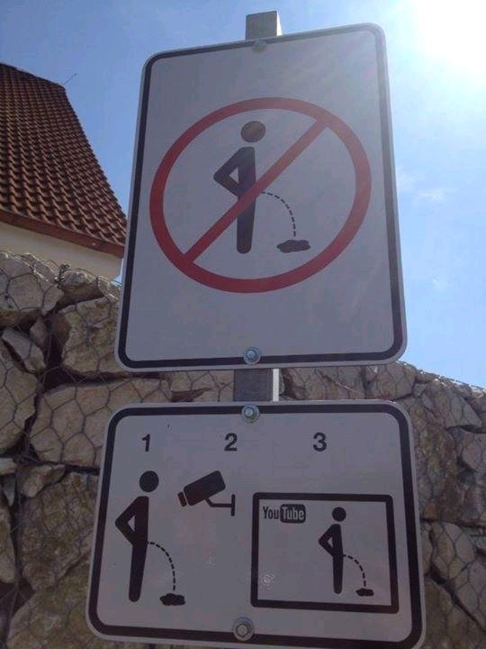
 This is how they prevent people from urinating in public in the Czech Republic.
Looks like google dumbed down the YouTube home page by making it look like some retarded mobile app. Fuck this shit I'm not using my fingers and my fingers arent so fat that I need 5 cm large thumbnail ffs.
rant
i've got enough display density
youtube
dumb mobile app interface