Ranter
Join devRant
Do all the things like
++ or -- rants, post your own rants, comment on others' rants and build your customized dev avatar
Sign Up
Pipeless API

From the creators of devRant, Pipeless lets you power real-time personalized recommendations and activity feeds using a simple API
Learn More
Comments
-
Idk, they look good to me. Word -- blue rows, excel - green cells, outlook - blue calendar [days' cells], onenote - pink notepad w/ tags...
All look legit. And pretty I must say -
@netikras now explain powerpoint. That is the only one I dont understand and you skipped xD
-
I actually like it, tho the fact that it looks like a ripped off version of stackexchange makes me distressed, lol
-
Imo word is not descriptive enough. Rows are too far away from text documents.
Also pie chart for powerpoint is a bit silly. Maybe they could have gone up with something more fundamental. It also breaks the theme. -
The Outlook one keeps making me see a micro SD card when I look at that new icon on my phone.
-
@Alice I said the color choice (color palette) resembles stack exchange icons
I actually like the minimalist look the match well with the windows 10 metro design
Related Rants


 !rant
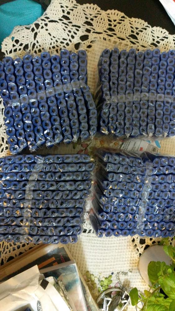
400 Nerf bullets just arrived... Office is gonna become a war zone...
 When stack is down 😵
I wonder why new Office icons look like a ripoff from stack exchange....
rant
icons
office
stackexchange