Ranter
Join devRant
Do all the things like
++ or -- rants, post your own rants, comment on others' rants and build your customized dev avatar
Sign Up
Pipeless API

From the creators of devRant, Pipeless lets you power real-time personalized recommendations and activity feeds using a simple API
Learn More
Comments
-
-
Hi
I think your design is very clean and easy to navigate. Personally, my only comment would be to make the colour of the continue and exit buttons easier to read.
Consider inheriting the colour of the status for the continue button, for example, green when all status checks are green, orange in your example case when there is a shortage of storage. -
@Mitch377 @Mitch377 I know, forgot to update it here. I´ve removed it and create the repos again when I´ll start working on it. Currently I´m trying to figure out if the installer for my distro will be using Arch Linux or Debian as base OS. But since I´m pretty used to Ubuntu/Debian, I might only customize the Ubiquity installer.
-
https://github.com/ttomovcik/...
Damn. Making Linux distro is harder than I thought :/ Will see what can I do.
Related Rants

 My friend said an intern designed this UI for an internal site.
No. Just... no
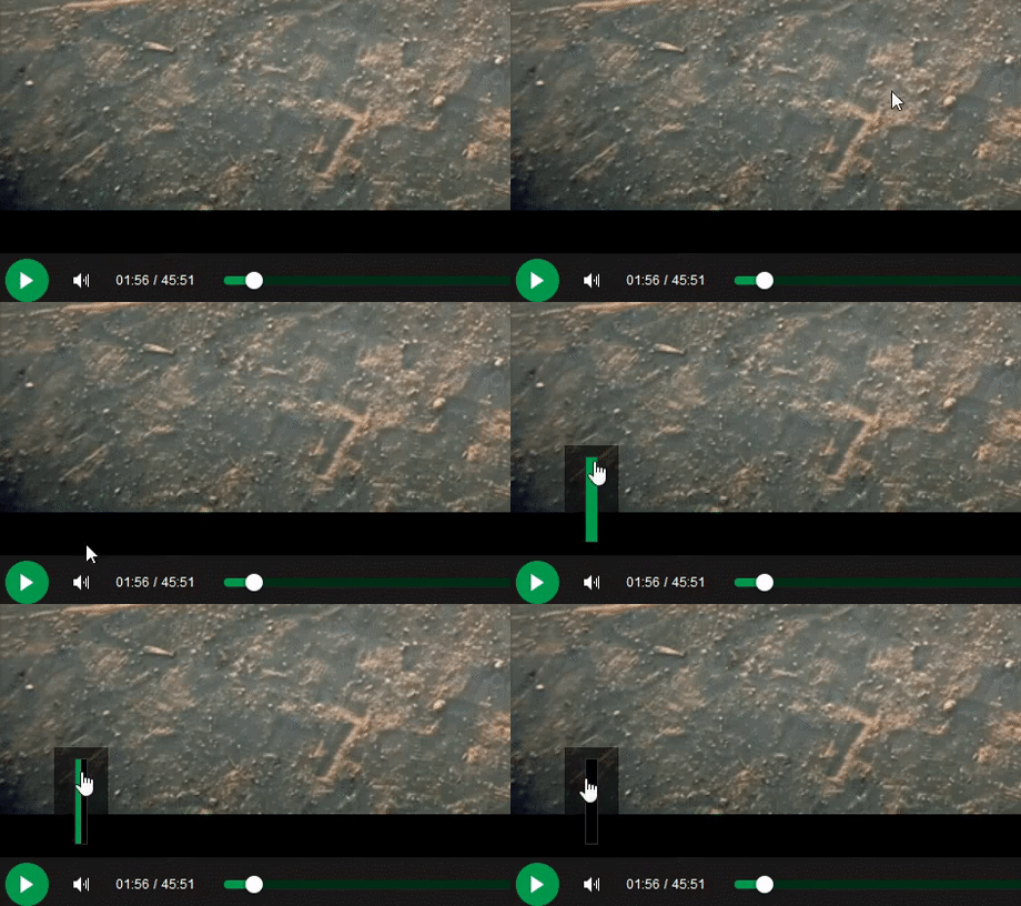
 Product dev: We need a new volume slider for ou...
Dev: Say no more!
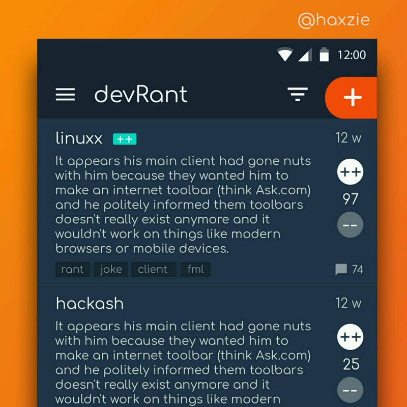
 Been looking around ways to improve devrant's user experience a little, Idk whether you guys like it or not.. ...
What do you all think about that. Is it good or nah? After few months of coding tried to do some UI design.
undefined
design
ui