Join devRant
Do all the things like
++ or -- rants, post your own rants, comment on others' rants and build your customized dev avatar
Sign Up
Pipeless API

From the creators of devRant, Pipeless lets you power real-time personalized recommendations and activity feeds using a simple API
Learn More
Related Rants

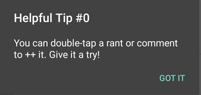
 So as new user I used devrant straight for 6 hours and this happened.
Am I the only one who thinks this helpfu...
@dfox
Just a suggestion, when scrolling down on a user's profile, their user information should scroll up too along with the 'rants/+1's/comments' tabs and then those tabs stay fixed while the user information hides. Sort of like what Twitter does
There's not much room to view the actual content with all the user information in the way. Of course once we scroll back up, it will then reveal the user info again
:-)
undefined
suggestion
idea