Ranter
Join devRant
Do all the things like
++ or -- rants, post your own rants, comment on others' rants and build your customized dev avatar
Sign Up
Pipeless API

From the creators of devRant, Pipeless lets you power real-time personalized recommendations and activity feeds using a simple API
Learn More
Comments
-
 theuser46456yWell, once everybody starts doing those excessive animations, its gonna get real old, real fast. The problem here is that animations are supposed to draw your attention away from your usual reading direction, but with overuse it becomes tedious and chaotic.
So, nice simple design on the page, I like that. The animations are real bad. Please stop it.
Also, nice console.log -
What an annoying piece of shit. All these "oohh so cooool" animations are awesome the first time you actually use the website and suck donkeys ever after. Also, that design only kinda "works" because there's nearly no content.
And then the asshole moves like disabling user zoom, contrast problems, heading hierarchy problems. Sloppiness like superfluous self-closing tags but only half of the time, nonsense attributes, forgotten attribute quotes, and of course invalid HTML.
Yeah, trendy shit. -
Much like most modern websites, it's stylistically cool and functionally irritating.
Related Rants

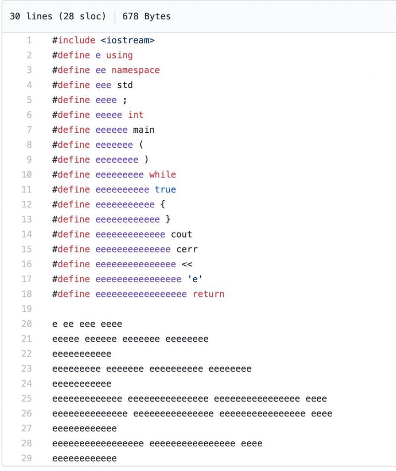
 I'd do this soon to piss the professor off
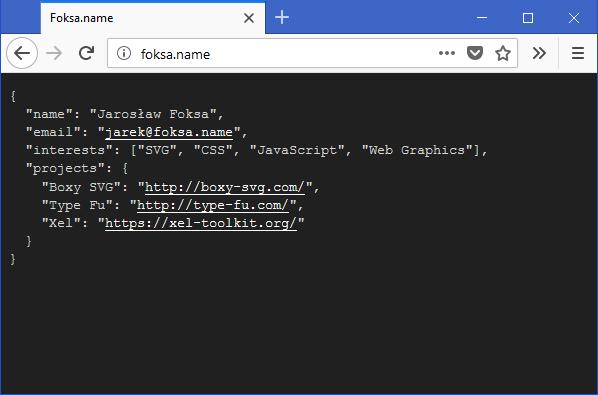
 Man, this dude knows webdesign
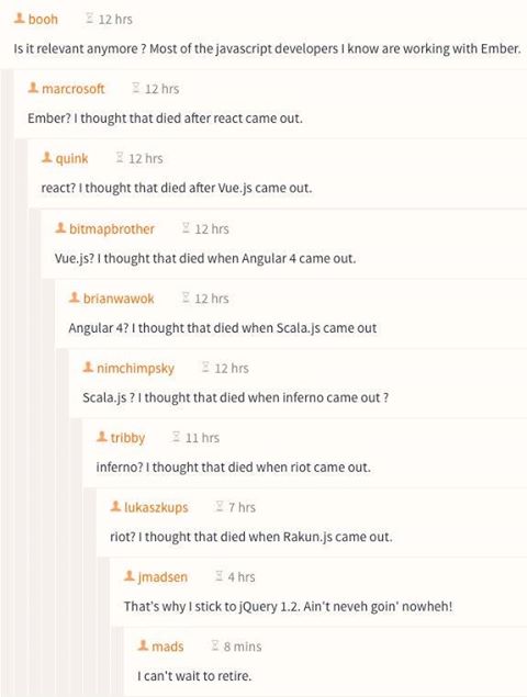
 This just made my day
2020 Website design trend example
https://www.tn-ict.com/en/
butter smooth transitions, contextualized displaying of information. Break up of the traditional page paradigm.
random
nice
webdesign
hinderling&volkart
2020
example