Ranter
Join devRant
Do all the things like
++ or -- rants, post your own rants, comment on others' rants and build your customized dev avatar
Sign Up
Pipeless API

From the creators of devRant, Pipeless lets you power real-time personalized recommendations and activity feeds using a simple API
Learn More
Comments
-
The problem with that is the new gestures on Android 10. I would fucking rage quit because of how many times you accidentally go backwards
-
Have to disagree. You'd have to look at every single piece of content. To browse through large numbers of content would require you to scroll every time, instead of just being able to scroll once and see what goes by.
And fyi, the Reddit app has this feature -
Adding on to other comments… when the content is large enough that it needs scrolling, you’ll end up with 4-way scrolling.
Horizontal scrolling works great for images, not for text. -
arte92196yYou can do this in the official reddit app(on android at least)
First open one post, then you can start scrolling sideways
Related Rants
-
 makarand14
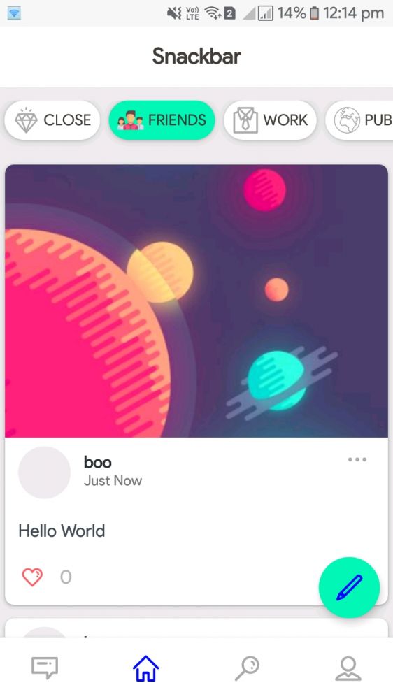
 # Need review about user interface.
// Its a social media application.
// Following screenshot is the Feed pa...
 -
 JackToolsNet2Am I wrong. Creating a nice User interface is a never ending story...
 -
 Wisecrack6If you're making a game, dont start by thinking about your inventory system. Start by thinking about what you ...

Dear Instagram, Reddit, Twitter, devRant, and almost every social media site available:
Scrolling down on a phone is much less natural than scrolling sideways and having the scroll snap to the next unit of content.
Like every pictures/ gallery app. It's a lot easier to focus on one piece of content and it even shortens the duration of scroll required in many cases thanks to the snapping.
rant
user interface