Ranter
Join devRant
Do all the things like
++ or -- rants, post your own rants, comment on others' rants and build your customized dev avatar
Sign Up
Pipeless API

From the creators of devRant, Pipeless lets you power real-time personalized recommendations and activity feeds using a simple API
Learn More
Comments
-
 C0D4643086yI do enjoy awwward for its nominations, but I personally dislike the winning entries every now and again.
 -
Nice works, but for me often too generic and templatey, overuse of large photography which itself of course is one of the easiest way to impress viewer and does half of the job of graphic designer.
But I like brutalism, minimalism and such weird shit in web that normal people consider strange at best, so... :D -
I'm a backend dev too. Because of designing is hard we can't say it's for no brainier.
-
Awwkwards and Drivvvle are hallmarks of bad web design by people who are pixel pushers in Photoshop and don't even know what web design is, but delude themselves into thinking they do.
-
Without things like awwwards and dribble the web would be stuck in the early 2000s. A desaster made by people just like you who only care about tech stuff, function and their own hubris. Thankfully there are people with empathy who cherish aesthetics and the visual wellbeeing of the user. Those people are called designers. Without designers who push the boundaries we'd still do drab web typography with Arial, Verdana and Times fucking New Roman.
-
Lexter11326yDesigners can do whatever they want, but when i need to wait 10 seconds to load their shit tons of crap, click tenth times more i need, geting a head pain from all that animations and other stuff... Yes, they are maybe artists, but no webdesigners. Deal with it. Basics are basics. Having inovative design is fine, but when i can't use it in fast way... Web closed and competition wining. Awwwards forgot what they should judge and what they should look for.
-
Designers are no artists.
Design is the process of assessing the needs of the client and foremost the end users. And translating this into requirements in form of a written concept. This design concept describes how the product is supposed work and how exactly it satisfyies the users needs. No artism here. It's cold hard facts and evidence based work.
After that the designer translates the findings into tangible assests. Like in color, space and typography. Which you as a programmer get to whine about. But thanks to the thorough research and reasoning thankfully to no avail. 😄 -
@heyheni Thanks to incompetent managers and clients who are just as stuck in print as the artsy idiots, we get superficially "pretty", but unusable websites.
Who do you think started the idiocy with thin light-grey fonts on white background that are unreadable even for sighted users? Why, "designers" of course.
You know, an aircraft system designer is first and foremost an engineer, not a Photoshop dick with no clue. In other domains, "design" is an engineering process, not adding pretty, useless and outright unusable bling-bling.
Related Rants

 My friend said an intern designed this UI for an internal site.
No. Just... no
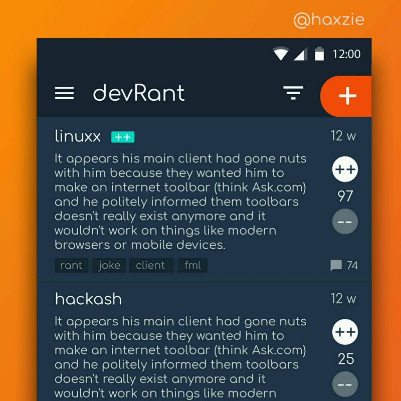
 Been looking around ways to improve devrant's user experience a little, Idk whether you guys like it or not.. ...
Stop fucking argue with awwwards you shithead. I have no time argue back to your tiny designer brain.
rant
design
awwwards