Ranter
Join devRant
Do all the things like
++ or -- rants, post your own rants, comment on others' rants and build your customized dev avatar
Sign Up
Pipeless API

From the creators of devRant, Pipeless lets you power real-time personalized recommendations and activity feeds using a simple API
Learn More
Comments
-
If you have a nice logo and designers with nothing to do, they will fuck up things and do stupid changes to simulate improvement. Mozilla is in a similar boat with their oversized UI department.
-
 galena74976yWas surprised android even had a logo. It all felt like a mixture of a lot of diffrent ones of which none came from google.
 -
Related Rants
-
 j4cobgarby31
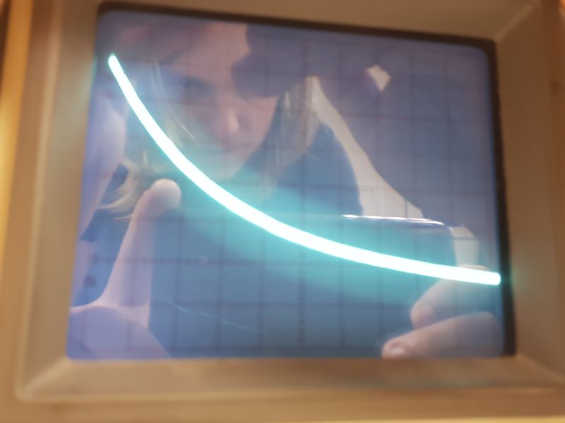
 Today at school I borrowed an oscilloscope and a few capacitors and used a circuit I made at home to just demo...
 -
 zacg21
 !(dev || rant)
Bought a 3KG bag of toffee from the chocolate factory for £5 :)
 -
 heyheni26
 lel, we've been robbed 10 minutes before midnight. We've been beaten by a hip bone looking stick. Sitting now ...

Anyone else feel like the rebranding was completely forced?
The typeface was so much better before. Google, I know you've invested heavily in sans-serif-ing the world for some reason but come on. Give it a rest.
rant
!dev