Ranter
Join devRant
Do all the things like
++ or -- rants, post your own rants, comment on others' rants and build your customized dev avatar
Sign Up
Pipeless API

From the creators of devRant, Pipeless lets you power real-time personalized recommendations and activity feeds using a simple API
Learn More
Comments
-
They have designers on payroll, maybe some creative director (or whatever) and they had to make sure they don't look useless and shouldn't actually been contracted as a one time job. It isn't as if it never happened before with many other software programs.
-
“A little simpler, a little clearer, and (we think) a little better.”
And more generic too.
Slack. Now with 25% more generic! -
edwardcjk957yI guess the new design direction...of the logo is... SLACKED off
Not a fan, prefer the old one -
 xeger1997yI discovered today that Slack has a terminal version too. Just saying, for ppl who don't want to be confronted with their controversial design decisions :D
github.com/erroneousboat/slack-term
Related Rants

 When you are so lazy to make a dark theme so you just add warning.
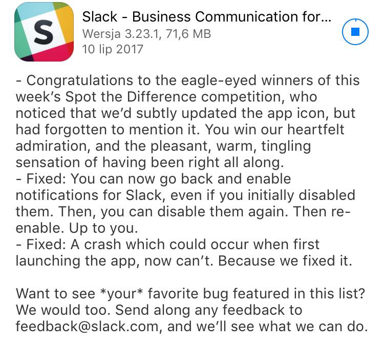
 I love the Slack changelogs 😂
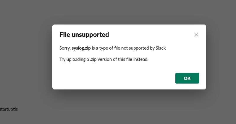
 oh boi
Why? 😑😑
joke/meme
slack