Ranter
Join devRant
Do all the things like
++ or -- rants, post your own rants, comment on others' rants and build your customized dev avatar
Sign Up
Pipeless API

From the creators of devRant, Pipeless lets you power real-time personalized recommendations and activity feeds using a simple API
Learn More
Comments
-
 CptFox15787yBut I loved the blobs :(
FFS Samsung needs to be at least slightly coherent with the others. I don't even use emoji that much and this might still prevent me from buying a Samsung next time I change my phone x) -
I don't think LG uses their emojiset anymore. I have a stock LG g6 and it uses android emojis. I don't even see the android emojis cause I use discord lol.
The blobs were the best. -
@gudishvibes discord uses the Twitter emojis... Its the exact same
https://twitter.com/discordapp/... -
THIS! Finally!!
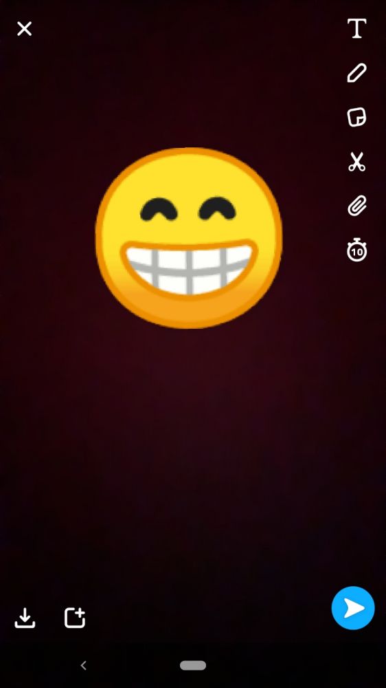
What the fuck are these three things!? That's not how smile works, that's a poker face with opened lips... -
-
For me the first three looks like they are in pain, like their stomach hurts really badly :/
Related Rants


 The New Bug Fixing Architecture.
 Some reviews can make you go nuts...
 Javascript why? (-‸ლ)
WTF is wrong with the first three!?? 😁
joke/meme
grinning faces gone wrong
ugly emoji
sarcasm is life