

Join devRant
Do all the things like
++ or -- rants, post your own rants, comment on others' rants and build your customized dev avatar
Sign Up
Pipeless API
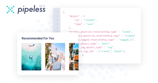
From the creators of devRant, Pipeless lets you power real-time personalized recommendations and activity feeds using a simple API
Learn More


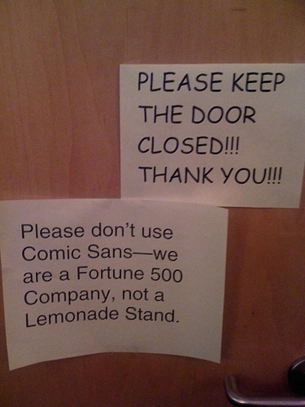 Comic sans 😂
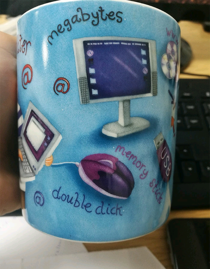 Not the best font choice....
(Read under the mouse)
Not the best font choice....
(Read under the mouse)
 Credits : hard.decoder on Instagram
https://instagram.com/p/...
Credits : hard.decoder on Instagram
https://instagram.com/p/...
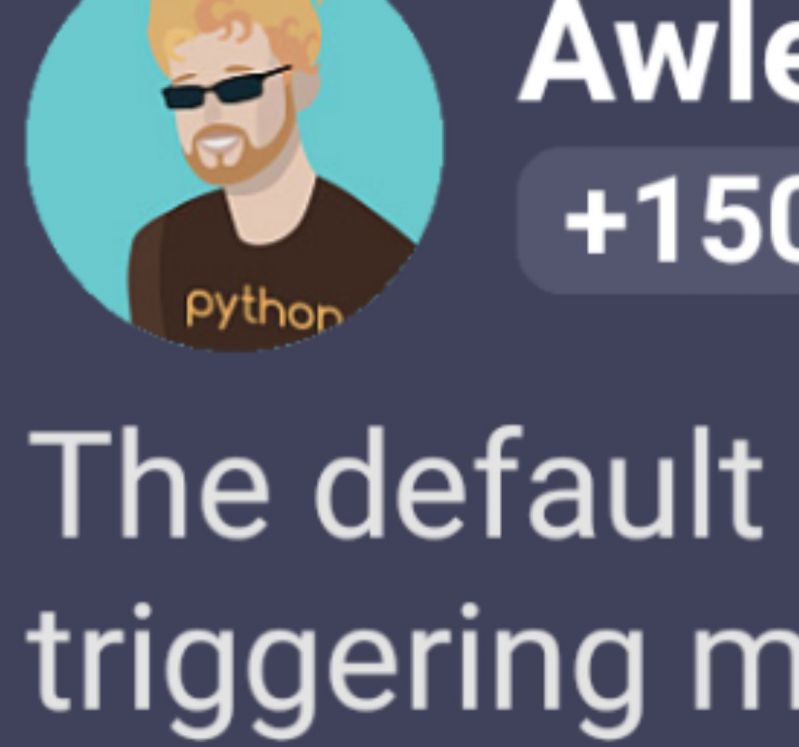
The default font for the Bulma CSS framework is triggering my OCD.
JUST WHY ARE THEY NOT ALIGNED FFS?!
rant
bulma css
bullshittery
font