

Join devRant
Do all the things like
++ or -- rants, post your own rants, comment on others' rants and build your customized dev avatar
Sign Up
Pipeless API
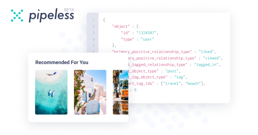
From the creators of devRant, Pipeless lets you power real-time personalized recommendations and activity feeds using a simple API
Learn More


I don't care, skeuomorphism like iOS 6 or window 7 aero was the peak of design and you can't convince me otherwise
rant