Ranter
Join devRant
Do all the things like
++ or -- rants, post your own rants, comment on others' rants and build your customized dev avatar
Sign Up
Pipeless API

From the creators of devRant, Pipeless lets you power real-time personalized recommendations and activity feeds using a simple API
Learn More
Comments
-
@Scrumplex yeah, I don't like how they change the tap and drag stuff without telling you. It looks like you can open it by tapping anywhere in the box except the 3 buttons.
-
@gitpush i dont use any framework. But these placeholders are like little notes for me, so I don't forget to replace them.
-
@spongessuck doesn't explain, why there are two different text colors in the appbar.
The URL is black, all icons are white. -
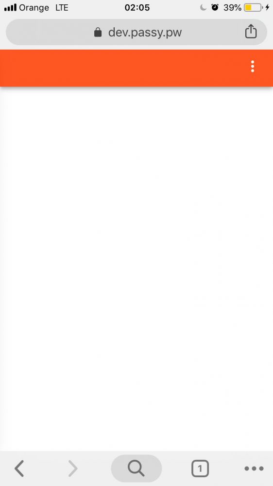
I think it's poor design to make a webpage have a status bar below the web browsers status bar. Google seems to just ignore the face that 200+ pixels are wasted and there are two fucking menu dropdowns right on top of each other.
-
@AlgoRythm and in case you expose the page's accent color in a custom statusbar and also use that color in the theme-color meta, I'd suggest a darker color for the latter to compliment the theme and the design.
-
@AlgoRythm it is supposed to be used as an embedded webapp (at least as long as I don't have a native app)

Related Rants


 My friend said an intern designed this UI for an internal site.
No. Just... no
 It all makes sense now...
Looks like Google forgot how to do good UX / UI design.
1.
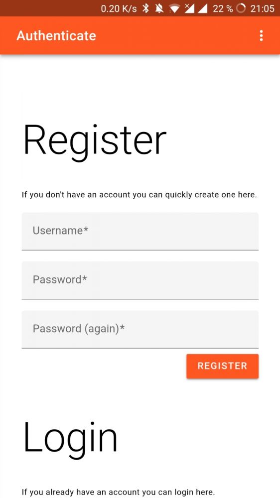
Why is the text in the appbar black, but all other icons (including the lock inside the textview) white. It would make sense, if the lock would be black too (as the textview is abit lighter than the appbar).
2.
Maps was way easier to use, before they invented MD Refresh. When you tap on a point on the map you get that info view at the bottom of the screen. Before it was a draggable window, which could be maximized with a swipe. Now you have to tap it, the box goes away and a new window appears, which is just the same as before MD-Refresh.
3.
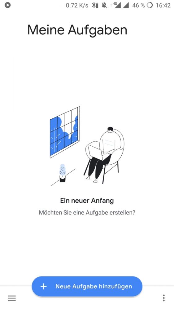
In "Google Tasks" the activity title is not centered for some reason.
rant
design
ui
google
android
material
md
wtf
ux