Ranter
Join devRant
Do all the things like
++ or -- rants, post your own rants, comment on others' rants and build your customized dev avatar
Sign Up
Pipeless API

From the creators of devRant, Pipeless lets you power real-time personalized recommendations and activity feeds using a simple API
Learn More
Comments
-
I design in 2-3 colors and then just search-and-replace to switch from light to dark, works well! At least now you can add a settings toggle for a dark theme :3
That being said light themes are associated with professional businesses, dark themed sites are only for screen intensive activity (developing, graphics, reading online, etc). I wish more companies would adopt dark themes and change that, like 99% of the time I spend on the internet I am indoors and in a dimly lit environment, it sucks having my eyes bleed out onto the keyboard. -
 Konsole30067y@woodworks Yeah. Dark theme actually better suits the purpose of our websites since it is for developers.
And I am enraged because I am actually working on backend of the website. But I was called to make the page as all the frontend devs are busy doing something else.
It takes me 10 times more time than them to do anything as I have to literally google everything.
So after an entire day of hardwork when the pm said he didn't like it, really pissed me off. -
 Konsole30067y@Alice The website is for developers so I thought dark theme would be more appropriate
Related Rants

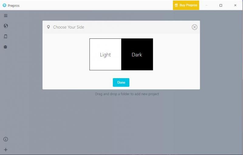
 This is how every app should start...
That moment when you spent an entire day making an awesome webpage (dark themed) and your pm tells you to change almost everything in it because he wants a light-themed website.
Fuck Everyone
(BTW now half the website is dark-themed and other half light-themed because pm doesn't know what he wants)
rant
waste of time
fucking productive sunday
dark theme
lovers of light can go to hell