Ranter
Join devRant
Do all the things like
++ or -- rants, post your own rants, comment on others' rants and build your customized dev avatar
Sign Up
Pipeless API

From the creators of devRant, Pipeless lets you power real-time personalized recommendations and activity feeds using a simple API
Learn More
Comments
-
I've never used the desktop site, but oh man that color scheme is seizure inducing.
-
 -vim-30838yI guess you can tweak the stylesheet, but the default being good is always better.
@trogus maybe darken the area where the text is -
@lazyDev I changed my Background color nonetheless as that low contrast is true eye bleech.
I recommend opening an issue on devRants' issue tracker:
https://github.com/devRant/devRant/...
That way @dfox can fix it :) -
 trogus130598yYeah... I nearly scrapped the idea just because of the low contrast yellow bg, but it worked well for the others so we actually darkened the yellow across the board in preparation (I wonder if anyone noticed). If it gets a lot of complaints, there are alternative approaches I was considering, but all less colorful and fun that this one.
Related Rants

 Well, that's 2018 in a nutshell I guess
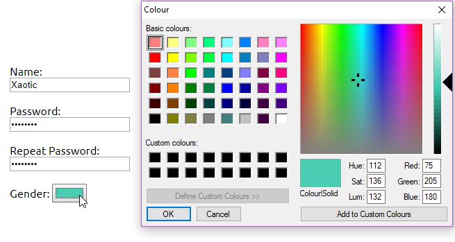
 Thanks Google. We now have a color picker for hex, rgb and more in the Google Search.
 My colleague left her PC unlocked with an open project so I changed all her IDE colors to white. White text on...
When I open rents on web, some of them are backgrounded by very intense colors. When the rant is a little bit long, this becomes harmful for the eyes.
Who else noticed that?
joke/meme
needs fix
color
my eyes