Ranter
Join devRant
Do all the things like
++ or -- rants, post your own rants, comment on others' rants and build your customized dev avatar
Sign Up
Pipeless API

From the creators of devRant, Pipeless lets you power real-time personalized recommendations and activity feeds using a simple API
Learn More
Comments
-
Color association
white; innocent, pure, clean, lightweight
dark; ransomware, insecure, .. -
 -vim-30838y@runfrodorun I wasn’t talking about the screen and eye thing, I was talking about the “unpleasingness” of light theme and how it’s awful
 -
@runfrodorun thats why one should when its dark use some bluelightfilter anyway indeed.
-
 CWins47428yMaybe because that light&dark theme stuff is more about the people's self-image than the actual difference between themes and colors.
 -
@runfrodorun This is why OLED is awesome. Black pixels are literally off. Using the devrant black theme on my phone only emits light from the text and UI components.
Not only way easier on your eyes at night, but improves battery life too. -
@justsomeguy I really love OLED for that reason, but doesnt it usually come with heavy burn-in issues?
-
@JoshBent Eh, this is my third phone with OLED and I haven't ran into anything that affects usage. In fact, it's not even noticeable unless you max out the brightness and put on a solid color (best being grey) to see it.
That being said, I never use a phone for longer than a year. After 2 or 3 years it could be considerably worse.
But then again, the only components on your screen that are static is your navigation buttons and status bar - and even then, they're not completely static (icons change + navigation disappears on full screen apps. On my OP5T my navigation buttons automatically hide, I have to swipe up to see them which would help with that considerably too) -
I would say that stereotypes still influence design ideas to some extent when creating this kind of software
Related Rants

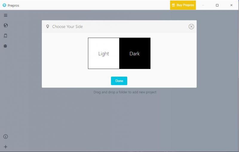
 This is how every app should start...
Sometimes I ask myself why dark theme isn’t the default setting on apps. I mean, light theme WRECKS YOUR EYES!!! How can the common way of designing is to make light theme default or JUST NOT HAVE A DARK THEME!!!!! It’s so unnatural!!!! Anyway...
rant
dark theme
dark theme is the best
dark theme is life
light theme for light weights baby
dark mode