Join devRant
Do all the things like
++ or -- rants, post your own rants, comment on others' rants and build your customized dev avatar
Sign Up
Pipeless API

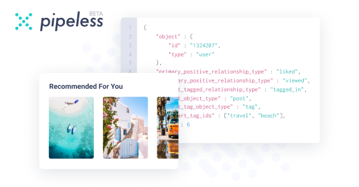
From the creators of devRant, Pipeless lets you power real-time personalized recommendations and activity feeds using a simple API
Learn More
Related Rants

So I've received a link to Figma for the new mobile app from our designer. It looks great and all but...
Each fucking piece of text is styled independently. Half of the cards in the layout are simple rounded rectangles, the other half are some components with a gradient. Icons are a mix of vector graphics and line elements. Even buttons aren't components. Consistence anyone? Please?
And now comes the best part. How am I even supposed to reach half of the screens? There are four variants of a screen with very similar functionality, but only a single button in the main screen which would at least remotely correspond to one of them. The guy who invented the wirescreens just kept adding things which would be nice to have in the final app, without revising it and making clear use case flows out of it?
After a few days of implementing this clusterfuck of a design, I have finally settled on a consistent set of font and element themes. Just please use components in Figma. You are paid to work in this tool which can make it super easy for the developer AND for you as well to make the design come to life, so why don't you learn to use it?
At least the designer is a nice guy, but god, could he learn to use his single tool?
rant
figma
incompetence
styles